
Bedroom Colour Schemes: The Best Shades for 2026

Share
X
Copy Link
The best bedroom colour scheme is one that works with the room's natural light and creates the atmosphere you want at the beginning and end of the day. Sage and warm neutrals are dependable calming choices, muted blues suit brighter rooms, and deep green, navy or charcoal can create a more cocooning bedroom.
This guide compares six versatile bedroom palettes, with paint suggestions, undertones, room-orientation advice and practical ways to coordinate furniture, curtains, rugs and lighting.
Best bedroom colours at a glance
| Room or goal | Colours to consider | Why they work |
|---|---|---|
| North-facing bedroom | Warm white, cream, blush, olive | Warm undertones balance cooler natural light. |
| South-facing bedroom | Sage, blue-grey, denim blue, soft grey | Warm daylight supports cooler and more muted shades. |
| Small bedroom | Warm neutral, pale blue, soft pink—or one confident dark shade | Light colours feel open; a consistent dark scheme can feel deliberate and cocooning. |
| Calm bedroom | Muted green, powder blue, warm beige | Low-contrast, desaturated colours create a quieter visual backdrop. |
| Dark, cosy bedroom | Navy, deep green, charcoal, chocolate brown | Deeper shades add intimacy when balanced with layered lighting and lighter textiles. |
On a phone, swipe the table sideways to see every column.
Green Bedroom Colour Schemes
Green is a versatile bedroom colour because its warmer and cooler variations work with very different light conditions. Sage, olive and moss are softer choices; emerald creates stronger contrast and a more dramatic result.
Muted greens create a low-contrast, restful backdrop and combine easily with timber, linen, rattan and warm metals. The undertone matters: yellow-based olive feels warmer, while blue-based sage can look cooler in a north-facing room.
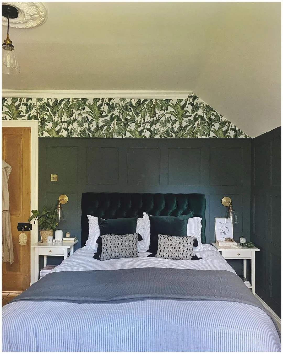
Deep green bedroom in the home of @woodsintothewoods
Paint colours to consider
- For a truly striking green bedroom, take inspiration from @woodsintothewoods, who created a stunning dark Victorian bedroom using Farrow & Ball's Downpipe on the woodwork — proof that green and dark grey are a match made in heaven.
- Little Greene Sage Green — Slightly warmer and more yellow-toned, perfect for south-facing rooms where the light brings out its golden undertones.
- Dulux Tranquil Dawn — A soft sage-meets-grey that's ideal if you want green without fully committing. Works brilliantly in smaller bedrooms.
- Farrow & Ball Studio Green — For the bold: a rich, deep emerald that creates incredible drama. Best in larger rooms with good natural light.
- Farrow & Ball Vert De Terre — A beautiful muted sage-green that works in almost any bedroom. We love how @crack_the_shutters paired it with vertical panelling for a fresh, modern country look.
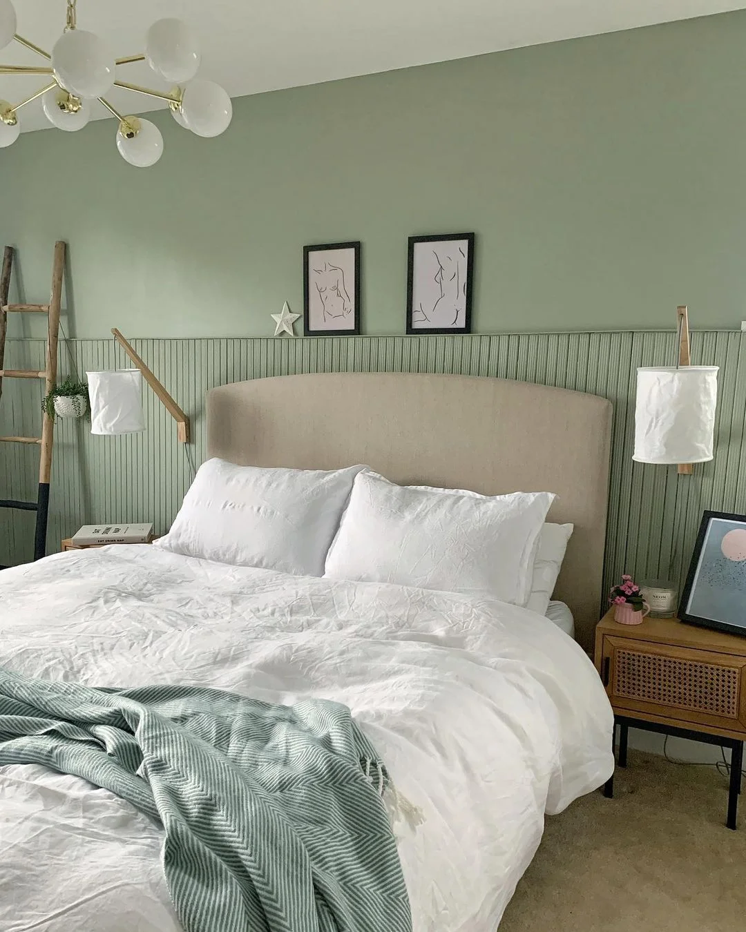
Relaxing bedroom in the home of @crack_the_shutters
Styling tips
Green pairs beautifully with natural materials — think rattan headboards, wooden bedside tables, and linen bedding in oatmeal or white. For a more contemporary feel, try brass or aged gold hardware and picture frames against sage walls. If you're going dark green, keep bedding light to avoid the room feeling too heavy.
Best suited to
Sage and olive greens work in almost any bedroom, regardless of size. Deeper emerald shades are best reserved for rooms with decent natural light or used as a feature wall. North-facing rooms benefit from warmer greens (olive, moss) rather than cooler sages.
Blue Bedroom Colour Schemes
Blue can make a bedroom feel crisp or cocooning depending on its depth. Powder blue and dusty slate keep the room light, denim adds definition, and inky navy creates a stronger envelope of colour.
For a calmer result, choose a muted blue with grey in it and keep contrast gentle. Warm wood, cream textiles and brass prevent deeper blues from feeling cold.
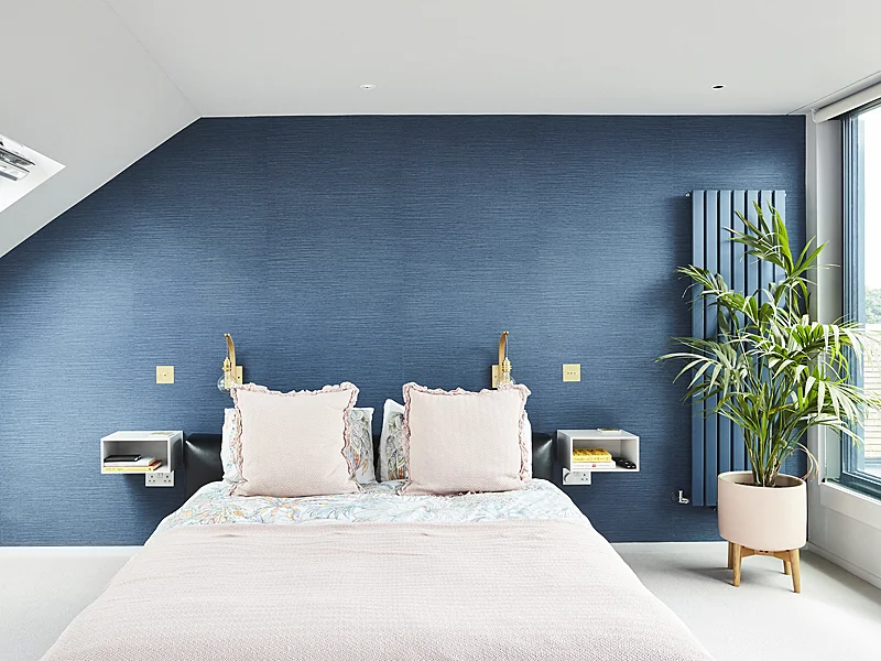
Loft conversion and design by ARCHEA
Paint colours to consider
- Farrow & Ball Stiffkey Blue — A rich, inky navy that's become a modern classic. Gorgeous on all four walls in a bedroom with high ceilings.
- Little Greene Pale Wedgwood — A sophisticated powder blue with grey undertones. Perfect for a serene, airy bedroom.
- Dulux Denim Drift — The mid-tone denim blue that started a trend. Still looks fresh and works beautifully in medium-sized bedrooms.
- Farrow & Ball De Nimes — A versatile denim-inspired blue that sits perfectly between casual and refined.
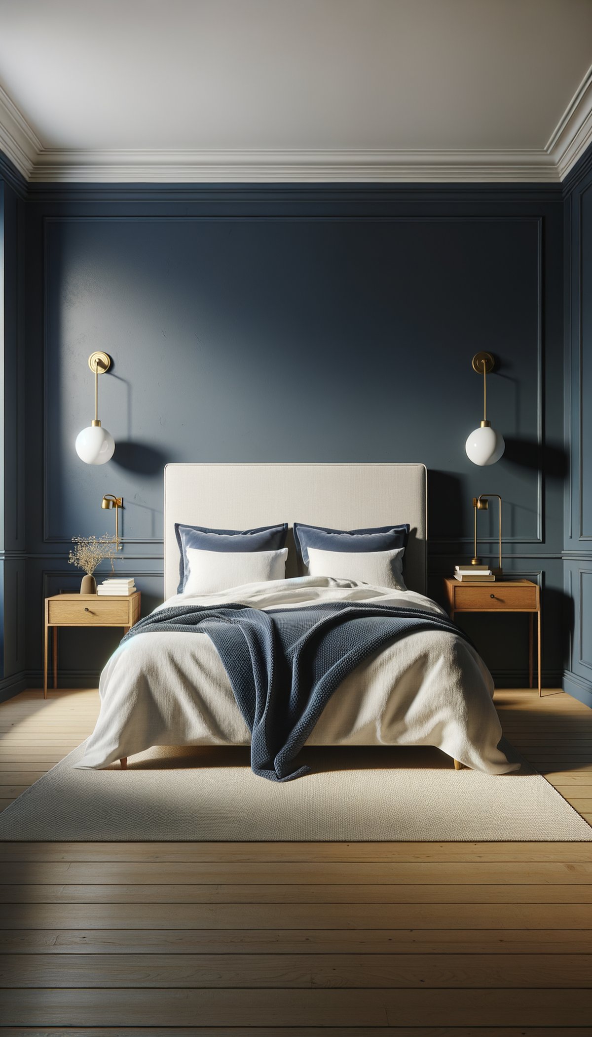
Deep inky navy blue bedroom with brass wall lights
Styling tips
Lighter blues work wonderfully with white woodwork and crisp white bedding — it's a combination that never dates. For deeper navy schemes, try warming things up with tan leather, cognac-toned accessories, and brass lighting. Layered textiles in cream and stone add softness without competing with the blue.
Best suited to
Powder and denim blues are incredibly versatile and suit bedrooms of any size. Navy works best in rooms with good natural light or when balanced with lighter furniture and bedding. South and west-facing rooms tend to bring out the best in blue schemes, while north-facing rooms may want to lean towards warmer blue-greys rather than pure blues.
Pink Bedroom Colour Schemes
Pink in the bedroom has grown up. The millennial pink wave has evolved into something subtler and more sophisticated — dusty blush, clay, and terracotta-tinged pinks that feel warm and grounding rather than sweet.
In 2026, the pinks were drawn to have an earthy, almost chalky quality. They create bedrooms that feel warm and cocooning without veering into "little girl's room" territory.
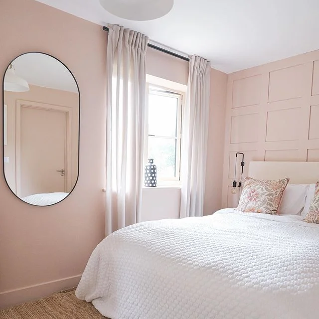
Tranquil bedroom in the home of @casacocointhecotswolds
Paint colours to consider
- Farrow & Ball Setting Plaster — The quintessential grown-up pink. It's barely there — more of a warm blush that catches the light beautifully. @casacocointhecotswolds used it to stunning effect for a soft, romantic bedroom.
- Little Greene Confetti — A slightly deeper clay pink with real warmth. Perfect if you want pink that doesn't feel too pale or washed out.
- Farrow & Ball Sulking Room Pink — A dusky, vintage pink with depth. The name says it all — moody, atmospheric, and utterly gorgeous.
- Dulux Soft Truffle — A pink-meets-beige that's ideal for anyone nervous about committing to a pink bedroom. It reads as a warm neutral with just a hint of blush.
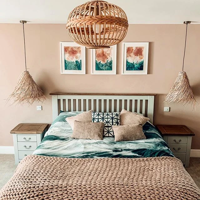
Creative bedroom in the home of @redbricks_lifestyle
Styling tips
Dusty pink walls look incredible with dark wood furniture — the contrast is rich without being jarring. Velvet cushions in plum or burgundy add a luxurious layer, while natural linen bedding in white or cream keeps things feeling fresh. For a more contemporary edge, pair pink with matte black accents — a black-framed mirror or bedside lamp lifts the whole scheme.
Best suited to
Pale blush pinks work in any sized room and actually make small bedrooms feel larger and warmer. Deeper clay pinks suit rooms with good natural light. Pink is one of the most flattering colours in any light condition — it makes skin tones look warm and healthy, which is a nice bonus for a bedroom.
Neutral Bedroom Colour Schemes: White, Cream & Beige
White, cream and beige are flexible bedroom choices, but their undertones determine whether the room feels warm or stark. Chalky whites, soft creams and nuanced beiges create more depth than a brilliant, blue-based white.
The key to a great neutral bedroom in 2026 is understanding that "neutral" doesn't mean "boring." It's about building layers of slightly different tones, mixing textures, and creating a scheme that feels warm, lived-in, and intentional.
For a masterclass in how to make neutrals feel anything but boring, look at @faithmitchellinteriors, who used Farrow & Ball Worsted (a warm grey-beige) as the perfect calming neutral base, accented with touches of black for definition.
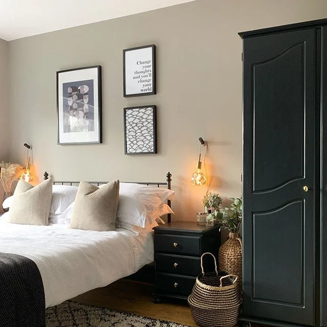
Bedroom in the home of @faithmitchellinteriors
Paint colours to consider
- Farrow & Ball School House White — A warm, honest white with enough depth to avoid feeling clinical. Brilliant on all four walls with contrasting woodwork.
- Little Greene Slaked Lime — A creamy, slightly chalky white that feels like sunlight. Perfect for bedrooms that need warmth.
- Farrow & Ball Jitney — A sophisticated warm beige that's neither too yellow nor too pink. The ultimate modern neutral.
- Dulux Natural Calico — An accessible warm cream that works in virtually every bedroom. A reliable choice that always looks good.
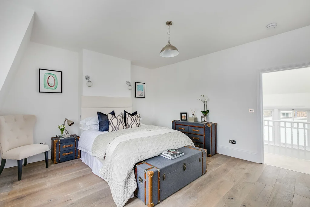
White bedroom by Simon Merrony Architects
Styling tips
In a neutral bedroom, texture is everything. This is where bouclé throws, chunky knit cushions, linen curtains, and sheepskin rugs earn their keep. Without varied textures, an all-neutral room can fall flat. Mix at least three different textures in your bedding and soft furnishings. Natural materials like wood, stone, and wicker add visual interest without introducing colour.
Best suited to
Neutral schemes are universally flattering and work in any bedroom, any size, any orientation. They're also the easiest to update seasonally — swap out cushions and throws for an instant refresh. For north-facing rooms, lean towards warmer whites and creams rather than cool ones.
Grey Bedroom Colour Schemes
Grey isn't going anywhere, but how we use it in 2026 is distinctly different from the grey-everything trend of the 2010s. The warm, greige-leaning greys are stepping back in favour of cooler, blue-toned greys that feel more sophisticated and deliberate.
The trick with grey in the bedroom is choosing a shade with the right undertone. A grey that works beautifully in a paint swatch can look completely different on your walls depending on your room's light.
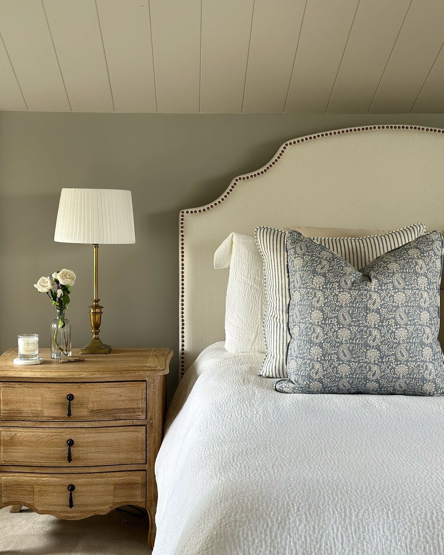
The perfect country bedroom in the home of @renovating_paddock_hill
Paint colours to consider
- Farrow & Ball Pavilion Gray — A gentle blue-grey that's light enough to feel airy but interesting enough to have real character.
- Little Greene Bone China Blue — Despite the name, it reads as a gorgeous blue-grey. Incredibly calming in a bedroom.
- Farrow & Ball Manor House Gray — A mid-tone cool grey with beautiful depth. Works particularly well with white bedding and warm wood tones.
- Dulux Chic Shadow— A popular mid-grey with blue undertones. Accessible and easy to work with.
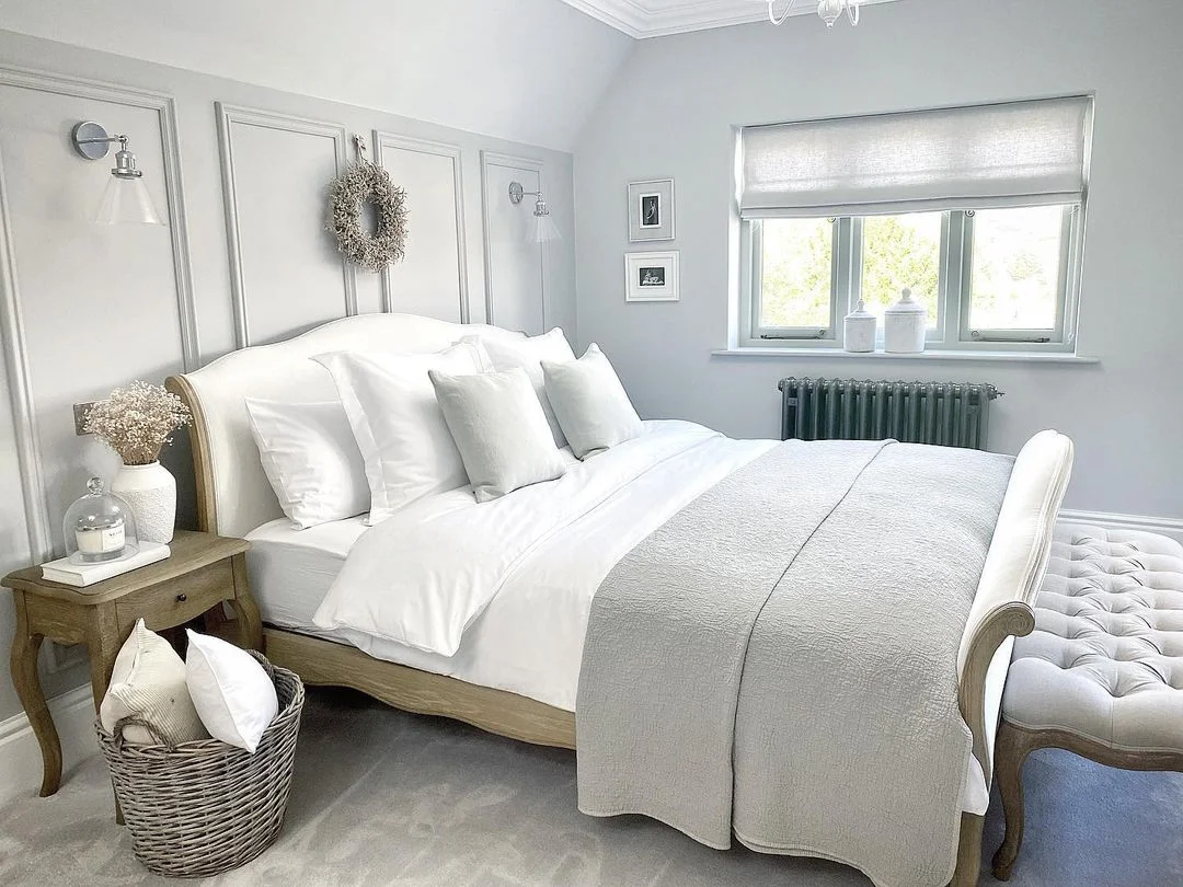
Beautiful bedroom from the home of @katy.harwood.life
Styling tips
Cool greys come alive when paired with warm metallics — think brushed brass, antique gold, or copper. Blush pink accents also work beautifully against blue-grey walls. For bedding, white and silver-grey create a cohesive, hotel-like feel, while mustard or amber cushions add a welcome pop of warmth.
Best suited to
Lighter greys are versatile enough for any room. Darker greys need decent natural light or good artificial lighting to avoid feeling gloomy. South-facing rooms handle grey particularly well, as the warm light counterbalances the cool tones. In north-facing rooms, consider a grey with slight warm undertones to avoid the space feeling cold.
Dark & Moody Bedroom Colour Schemes
Black, deep charcoal, navy and chocolate brown can create a cocooning bedroom when the scheme is carried through consistently and balanced with texture and layered lighting.
Dark paint does not automatically make a bedroom feel smaller. Reducing contrast between adjoining walls can blur the room boundaries, while pale bedding and warm task lighting keep the result usable and balanced.
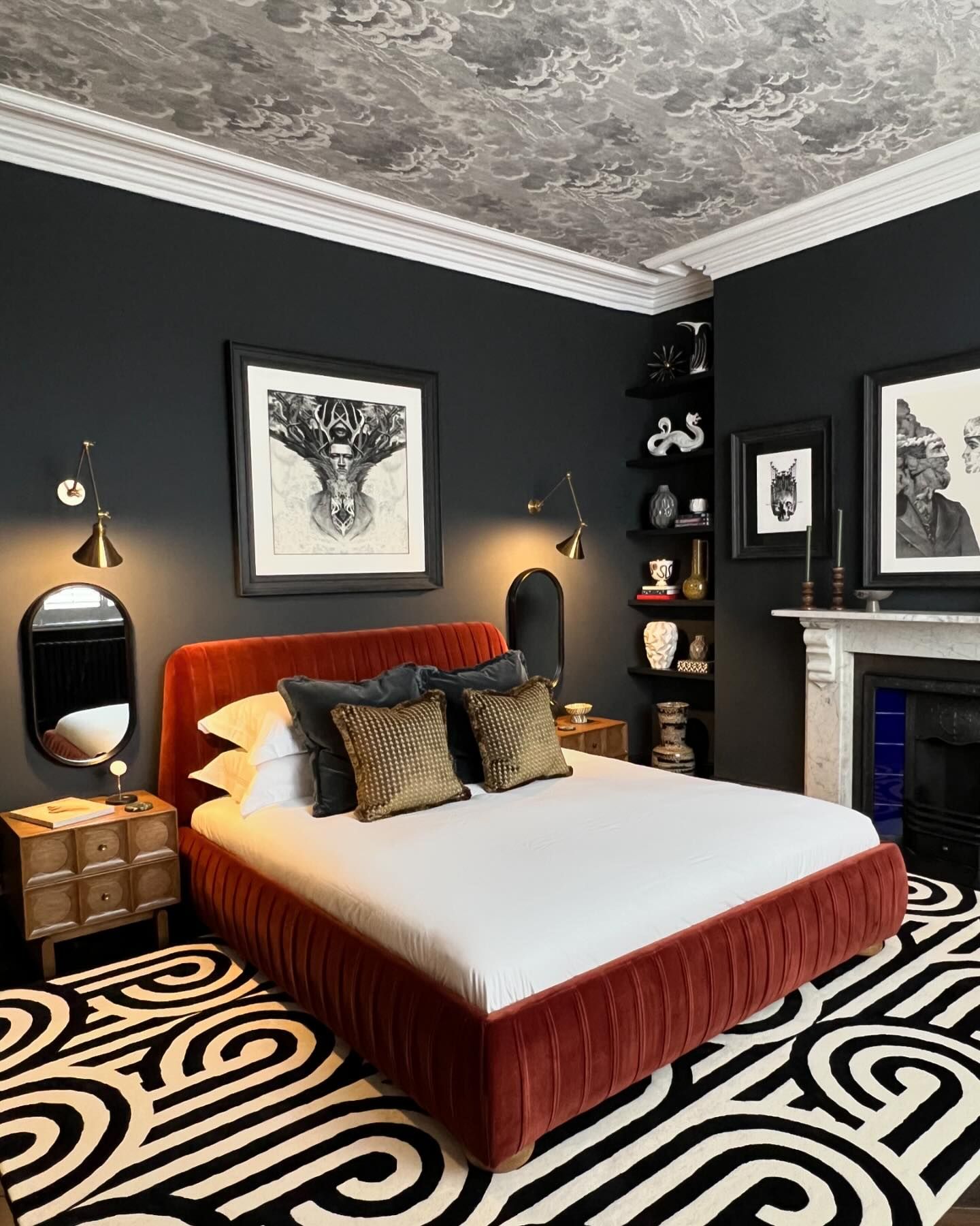
Striking bedroom in the home of @ourvictorianmoneypit in Railings
Paint colours to consider
- Farrow & Ball Railings — The definitive dark paint. It's a soft black with blue undertones that stops short of being stark. @ourvictorianmoneypit used it to incredible effect on an accent ceiling in a monochrome bedroom scheme.
- Little Greene Lamp Black — A rich, warm black with depth. Slightly softer than a true black, which makes it easier to live with.
- Farrow & Ball Tanner's Brown — For the brown comeback: a deep, rich chocolate that feels sophisticated and cocooning. Pair with cream bedding for maximum impact.
- Dulux Heritage Black Stillness — A beautifully matt black that absorbs light and creates a sense of enclosure. Dramatic but not cold.
- Little Greene Chocolate Colour — A warm, conker-brown that feels surprisingly contemporary. The surprise trend of 2026.
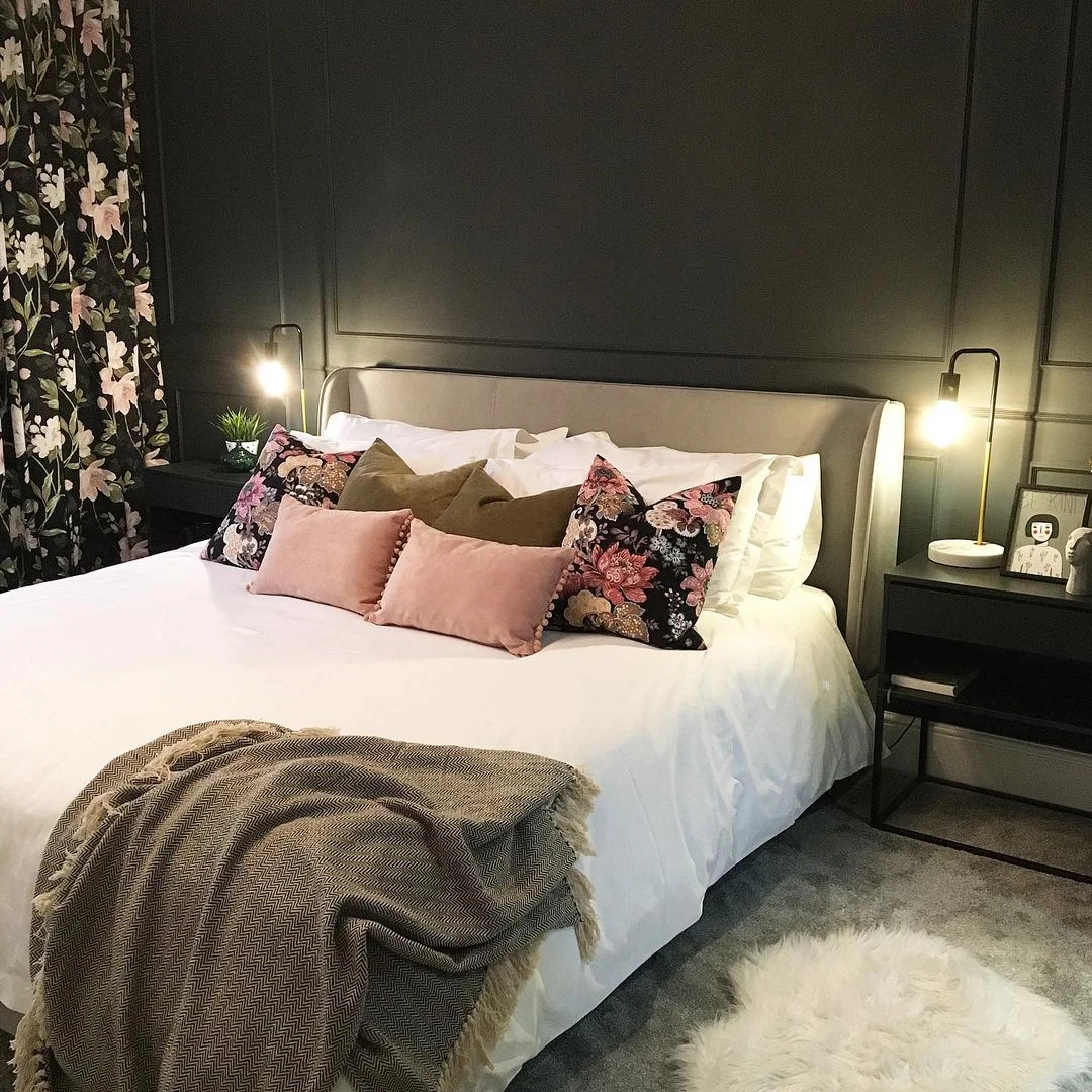
Dramatic bedroom in the home of @house_on_the_crescent
Styling tips
The secret to a successful dark bedroom is contrast and texture. White or cream bedding is essential — it stops the room feeling like a cave. Layer in rich textures: velvet cushions, a chunky wool throw, a plush rug underfoot. Metallic accents in brass or gold catch the light and add warmth. Good lighting matters more than ever in a dark room — think warm-toned bulbs, a statement bedside lamp, and perhaps some wall-mounted reading lights.
Best suited to
Dark colours work surprisingly well in both large and small bedrooms. In a small room, going fully dark can actually make the walls recede and create a cosy, den-like feel. The key is good lighting and keeping the ceiling lighter if you're worried about the space feeling too enclosed. South and west-facing rooms are ideal, but even north-facing bedrooms can work — the lack of direct sunlight can make dark tones feel even more cocooning.
How to Choose the Right Bedroom Colour Scheme
With so many gorgeous options, how do you actually decide? Here are the practical factors that should guide your choice.
Consider your room size
Small bedrooms don't have to be painted white — that's a myth worth busting. While light colours do reflect more light, a small room painted in a deep, enveloping colour can feel incredibly cosy and intentional. The key is committing fully: if you go dark in a small room, take it across all the walls (and possibly the ceiling) rather than doing one feature wall, which can make the space feel disjointed.
For larger bedrooms, you have the luxury of choice. Lighter colours will keep things feeling open and airy, while darker shades create intimacy and warmth in what might otherwise feel like a cavernous space.
Think about natural light
The orientation of your bedroom makes a real difference to how colours appear:
- North-facing rooms get cooler, bluer light. Warm tones (blush, cream, warm whites, olive green) help counterbalance this. Cool blues and greys can feel chilly.
- South-facing rooms get warm, golden light for most of the day. Almost any colour works here, but cooler tones (blue-greys, sage greens, blues) look particularly stunning.
- East-facing rooms get beautiful morning light but can feel cooler by evening. Warm neutrals and mid-tone colours work well.
- West-facing rooms glow in the evening. Deep, rich colours like navy, emerald, and burgundy look incredible in golden sunset light.
Always test paint samples on your actual walls and look at them at different times of day. That Farrow & Ball sample pot is the best £7 you'll spend in your entire renovation.
Consider ceiling height
High ceilings give you the freedom to use darker, more dramatic colours without the room feeling oppressive. You can even paint the ceiling a darker shade — @ourvictorianmoneypit's accent ceiling in Railings is a perfect example of how effective this can be.
Lower ceilings generally benefit from keeping the ceiling white or very light, even if the walls are dark. This creates the illusion of height. Alternatively, painting walls and ceiling the same light colour can blur the boundaries and make the room feel larger.
If you plan to colour-drench an empty room, our guide to choosing a paint sprayer for walls and ceilings explains the masking, paint and equipment considerations.
What mood do you want to create?
This is ultimately the most important question:
- Calm and serene: Soft blues, sage greens, pale neutrals
- Warm and cocooning: Deep greens, chocolate browns, charcoal, blush pinks
- Light and airy: Warm whites, pale creams, powder blues
- Dramatic and luxurious: Black, navy, emerald, deep plum
- Romantic and soft: Dusty pinks, warm greys, candlelight whites
The Texture Trend: Why Fabric Matters as Much as Paint
One of the biggest shifts in bedroom design for 2026 is the emphasis on texture. A beautifully painted room can still fall flat if the soft furnishings don't pull their weight.
Here's what we're seeing everywhere this year:
- Bouclé — The curly, nubbly fabric that's taken over headboards, cushions, and accent chairs. It adds instant warmth and tactile interest to any colour scheme.
- Linen bedding — Slightly rumpled, beautifully textured, and available in every colour imaginable. Linen gets softer with every wash and has a relaxed elegance that cotton can't quite match.
- Plush rugs — Whether it's a sheepskin beside the bed or a deep-pile area rug, something soft underfoot makes a bedroom feel instantly more luxurious.
- Layered throws — The days of the single, neatly folded throw are over. In 2026, it's all about layering different textures — a waffle-knit with a velvet cushion, a chunky wool with smooth cotton.
- Curtains with weight — Heavy linen or cotton curtains in a complementary tone add warmth and help anchor a colour scheme. They also block more light, which is never a bad thing in a bedroom.
The rule of thumb? Whatever your colour scheme, aim for at least three different textures in the room. This creates visual depth and makes the space feel curated and considered rather than flat.
How to carry your colour scheme through the room
Wall colour is only the starting point. The biggest furnishings and soft finishes determine whether a bedroom palette feels balanced, warm and intentional. Choose them after testing the paint in the room, and repeat a limited number of tones and materials rather than trying to match everything exactly.
Use a rug to connect the palette
A rug can bridge the gap between the floor, bed and walls while adding softness underfoot. Warm cream and beige designs support earthy greens, blush pinks and warm whites; blue or grey rugs can reinforce cooler schemes. Size and pile matter as much as colour, particularly around doors and fitted wardrobes. Our guide to the best bedroom rugs compares washable, low-pile, shaggy, round and coloured options, with practical placement advice.
Frame the scheme with curtains
Curtains occupy a large area of colour, so treat them as part of the palette rather than an afterthought. A close tonal match creates a calmer, enveloping room, while a darker or lighter version of the wall colour gives the window definition. For bedrooms, also consider heading style, finished width and light leakage. See our comparison of the best blackout curtains for bedrooms before choosing a colour and drop.
Make the bed the focal point
An upholstered bed introduces texture and can either soften a dark scheme or give a pale room more structure. Neutral linen-look fabrics are flexible, velvet adds depth and sheen, and a taller headboard creates stronger contrast against the wall. Always check the frame's external dimensions rather than relying on mattress size alone. Our guide to the best upholstered bed frames covers UK sizes, storage, slat support, fabric care and room clearance.
Use a mirror to balance light and colour
A well-positioned mirror can spread daylight and stop deep paint colours feeling flat, while its frame offers a simple way to repeat black, brass, gold or silver details. Scale is important: a narrow mirror is easier to place, but a wider design reflects more of the room and has greater visual impact. Compare freestanding, leaning, wall-mounted and oversized options in our guide to the best full-length bedroom mirrors.
Frequently asked questions
What is the most calming colour for a bedroom?
Muted greens, powder blues and warm neutrals are dependable choices because they create a soft, low-contrast backdrop. The best option still depends on the room’s natural light and the colours used for flooring, furniture and textiles.
Which colours make a small bedroom look bigger?
Warm whites, pale neutrals and soft blue-greys reflect more light and can make a small bedroom feel open. A consistent dark colour can also work by reducing visual boundaries, provided the room has suitable lighting and lighter elements for balance.
What colours work best in a north-facing bedroom?
North-facing rooms usually receive cooler light, so warm white, cream, blush, clay and yellow-based olive often feel more comfortable than crisp white or icy grey. Always test a large sample throughout the day.
Should a bedroom ceiling match the walls?
Matching the ceiling and walls can create a cohesive, enveloping effect and reduce visual breaks. A lighter ceiling is a safer choice where the room has a low ceiling, limited daylight or a very deep wall colour.
How many colours should a bedroom colour scheme use?
A simple scheme usually needs one dominant colour, one supporting neutral and one or two accents. Repeating those colours across textiles, artwork and small details produces a more coherent result than introducing many unrelated shades.
Can you use dark paint in a small bedroom?
Yes. Deep green, navy, charcoal or brown can make a small bedroom feel deliberate and cocooning. Carry the colour across adjoining walls, add layered lighting and use lighter bedding or flooring to maintain contrast.
Ready to Transform Your Bedroom?
Choosing a bedroom colour scheme can feel overwhelming, but the best advice we can give is this: trust your instincts. You know what makes you feel calm, what makes you feel happy, what makes you want to curl up and stay a while. Start with that feeling and work backwards to find the colour that creates it.
Test samples on your walls (always at least two coats on a decent-sized patch), live with them for a few days, and see how they change in different lights. The right colour will feel obvious when you find it.
And if you're looking for more renovation inspiration, check out our guides to bedroom ideas, living room colour schemes, and small bedroom ideas for more tips and inspiration.
You might also like:
• Small Bathroom Ideas to Maximise a Small Space
• Wet Room Guide: Designing the Perfect Space
• Walk-In Shower Ideas for Your Bathroom